Philadelphia Gas Works: a bill people can read.
A redesign of the Philadelphia Gas Works billing experience, turning a dense, anxiety-inducing bill into a clear and actionable one for more than 500,000 residential and business customers.
- Client
- Philadelphia Gas Works
- Role
- Senior UX Designer
- Scope
- Bill, digital, comms, self-service
- Started
- February 2019
The challenge
PGW is the city-owned utility that heats Philadelphia. Confusing bills, unreliable online payments and poor communication had worn down trust in every customer group, from low-income households to owners managing several business accounts.
That showed up as long call-center waits, public complaints on social media, late payments and customers who never found the assistance programs built for them. One business customer called PGW "the Comcast of gas."
Research
I led a multi-method research program: social media listening to capture unfiltered complaints, three moderated focus groups with 24 participants, a review of billing practices at peer utilities, and interviews with customer service, marketing, legal and finance.
The focus groups were split into three segments: low-income households (8), standard residential customers (7) and small-business and property managers (7).
"Terrified when people receive bill. Never know what the price will be."
Low-income participant"Bill means nothing to me, how much I owe and when it's due."
Residential participant"Always in a rabbit hole. How could I dispute it?"
Business participant
What we learned
- Bill anxiety was universal. It came from unpredictability, not just cost. Even customers on autopay were upset before opening the envelope.
- Digital failures blocked basic tasks. Site crashes, form errors and payment lockouts stopped people from paying at all.
- Everyone reads the summary; few read the detail. Every participant looked at the amount due, while usage charts drew mixed interest. The bill needed progressive disclosure.
- A hidden advantage. PGW charges no fee for any payment method, but nobody knew, so customers avoided paying online.
- Help was invisible. Low-income customers didn't know about or misunderstood the CRP and LIHEAP assistance programs.
- Inserts buried the essentials. Marketing flyers made important billing information easy to miss and easy to throw away.
The redesign
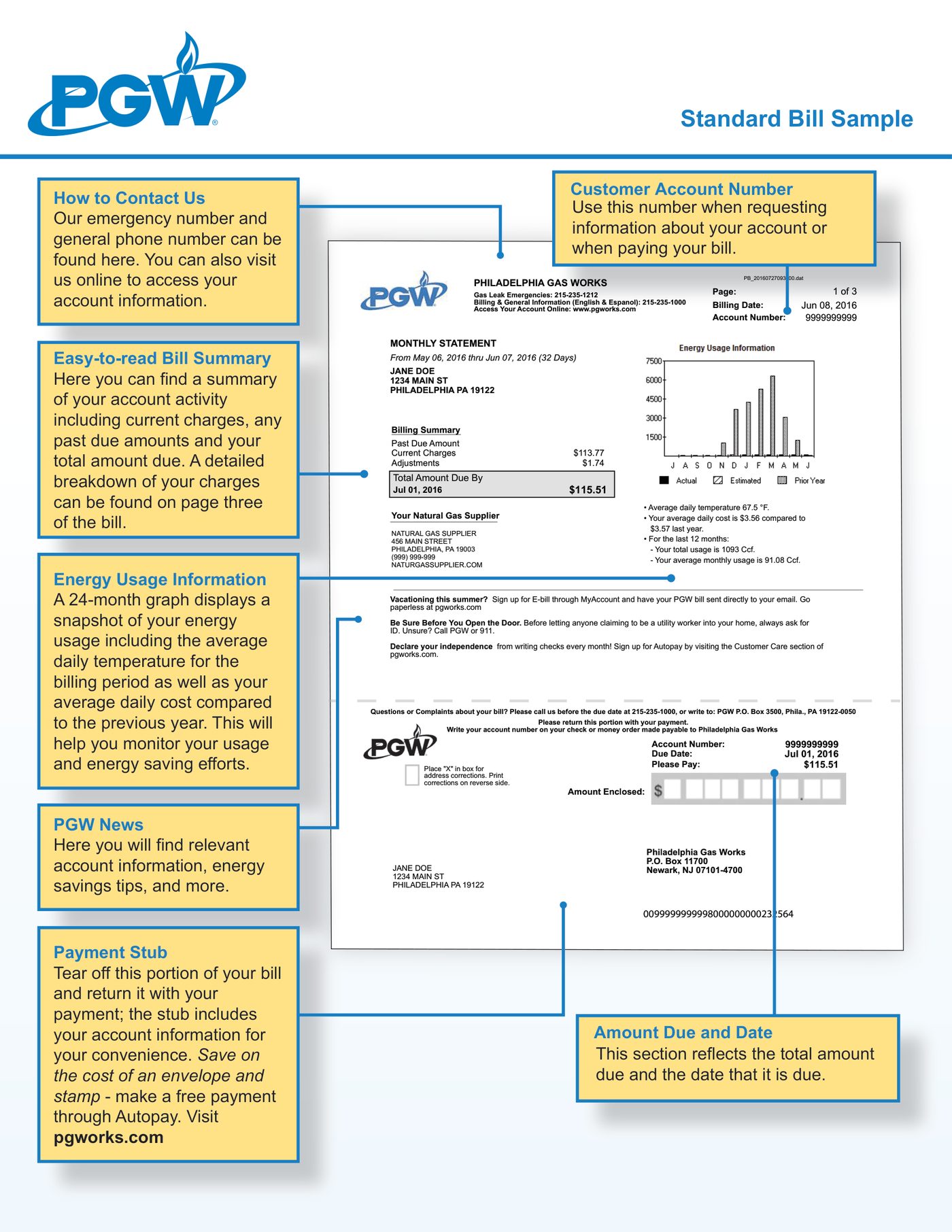
The bill became one modular system: the same core layout for everyone, with a segment-specific module that swaps in assistance programs, budget billing or multi-account tools. The amount due is set at 48pt, body text never drops below 12pt, contrast meets WCAG AA, and every payment option is marked NO FEE.
- 01HeaderLogo, account number, name and address
- 02Amount due48pt total, due date with color-coded urgency, payment status
- 03Quick payOnline, phone, mail, in person, all labeled NO FEE
- 04Bill summaryBilling period, current charges, previous balance
- 05Usage (collapsible)Chart, temperature comparison and tips on demand
- 06Segment moduleAssistance programs · budget billing · multi-account
Rollout
- Bill redesign. Modular layout, clear hierarchy, segment modules and NO FEE messaging.
- Digital experience. Form validation and error handling, responsive pages, a rebuilt payment flow and a multi-account business portal.
- Communication. Email bill alerts, SMS reminders and redesigned, color-coded mailers that avoid the patterns customers associate with scams.
- Self-service. FAQs by customer type, video tutorials, a 24/7 chatbot and a dedicated business support line.
These figures are the targets the redesign was projected to reach, not measured results.
What I'd do differently
Bring low-fidelity bill prototypes into the focus groups to iterate faster, capture call-volume and payment baselines before launch so impact can be measured precisely, and run formal usability testing with customers over 65 to validate type size and contrast.