OrbitCoat Painting: a brighter Florida ahead.
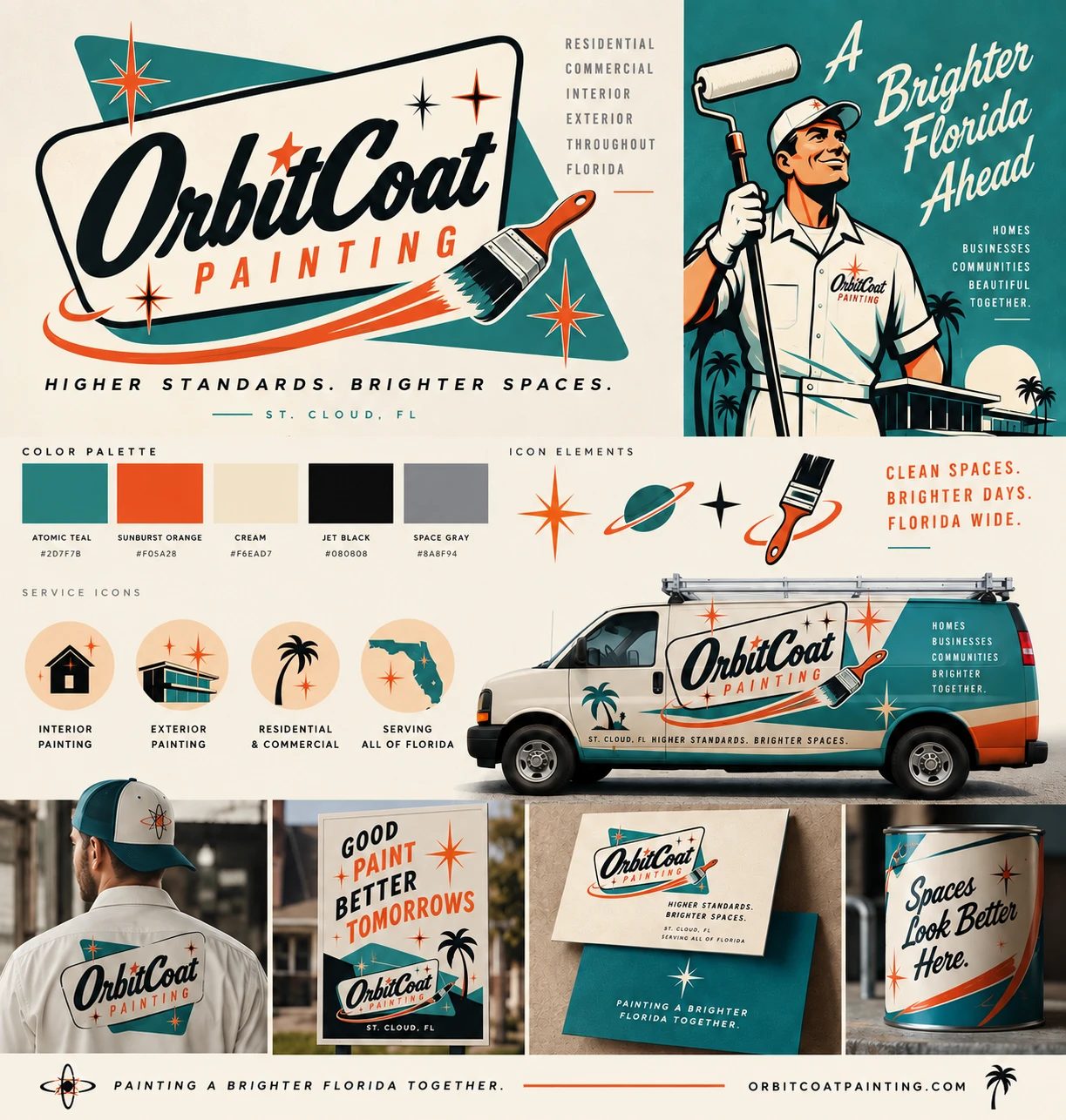
A complete identity for OrbitCoat Painting, a retro-inspired painting company in St. Cloud, Florida. OrbitCoat pairs quality paint with the kind of service and hospitality customers remember, and the brand needed to say both at a glance, on a van door as clearly as on a business card.
- Client
- OrbitCoat Painting
- Location
- St. Cloud, FL
- Services
- Identity, applications
- Year
- 2026
The idea
OrbitCoat sells more than a fresh coat. The company is built on doing the job right and treating every home and business like a guest. The identity borrows the warmth and confidence of 1950s roadside signage, with a boomerang-shaped sign, starbursts and a brush that leaves an orbit trail, so the brand feels friendly, local and proud of its work, and stands out from the street.
The system
A script wordmark paired with spaced capitals for Painting, the line Higher standards. Brighter spaces., a five-color palette, starburst and planet icon elements and four service icons for interior, exterior, residential and commercial work and statewide service.
- Atomic Teal#2D7F7B
- Sunburst Orange#F05A28
- Cream#F6EAD7
- Jet Black#080808
- Space Gray#8A8F94
Applications
Vehicle wrap, crew uniform and cap, yard sign, business cards, paint can label and an illustrated campaign poster: A Brighter Florida Ahead.